
The Challenge
Spork Designs was asked to facilitate the naming and development of a brand for the first bank to open in San Diego in over 10 years. This new bank had an initial committee of 18 members that would oversee and approve the new name as well as the accompanying logo and brand image. Our challenge was to come up with a name and design that satisfied the entire group, it’s target audience, as well as execute a number of deliverables consistent with the new branding for the opening of the bank.
The Target Audience
In this particular case, the target audience consisted of business owners seeking banking services tailored specifically to them, allowing for growth and prosperity, and not personal banking accounts. This information helped narrow our focus away from attracting individual accounts, to creating a brand that might invite small business owners looking for a way to give their enterprise a boost of capital.
Our Role
Our role primarily consists of guiding professionals through the creation process in a step-by-step fashion. One dynamic of our role was to walk a large committee of individuals through the naming and design process. This required us to educate the client on the process and keep them focused on the big picture. With so many eventual variables to contend with, we strived to lock down the most important factors of the process (the name & logo iconography) with the entire committee, and move on to the details (typeface, colors, tagline) with a fewer number of appointed decision makers. This allowed us to navigate a great number of opinions, strong personalities, and other challenges to narrow the field in respect to the name, logo, and fine details.
Our Goal
Defining the project goals was one of the most important steps in our development process. In order to keep everyone on track and eventually achieve approval from the full committee, we strived to clarify the most important factors in the creation of the naming and branding of the bank.
“Our goal is to create a strong name that will be easy to protect in the future.”
We had to consider legal and trademark ramifications in our design process, allowing for a unique naming, tagline, and icon structure that could be trademarked, owned and protected. Below is an excerpt from one of our early creative briefs to set us on a path to success:
“We aim to create a name & brand for your bank that is distinctive, yet descriptive, appropriate and relevant.
In our process, we will develop hundreds of names and consider tonality, construction, length, legal considerations, and domain availability. Then, we’ll deliver you the cream-of-the-crop. We’ll explore single words, multiple words, and compounds, real words and create unique coined words. We’ll consider how the brand will be extended in the future, and avoid names that will create a likelihood of confusion with someone else in the banking industry.
In order to succeed, we recommend involving key decision makers to participate and provide feedback. We must keep in mind the naming is subjective, but with the right process, we can strike gold.
We are working to capture the team’s values & expertise with a logo that is distinctive, trustworthy, timeless and memorable—simplicity with sophistication.
The bank’s logo will be the cornerstone of the bank’s brand. As part of the process, we’re designing an icon, setting the wordmark and selecting Pantone & Web Hex colors to define standards and create a consistency for your future branding & marketing layouts. We’ll be delivering the team care package of every print & web-friendly format, from a colorful billboard-size logo to a small black & white, vertical and horizontal formats.“
Initial Deliverables
We then set out to identify the major deliverables to help set the scope of the entire project, and define expectations.
- Bank Name
- Logo Design
- Letterhead & Business Cards
- Investment Deck Slideshows
- Investment Reports/Brochures
- Layouts on the team’s banking expertise
- Projection Charts & Graphs
- Official Memo Templates
- Timelines/Calendars/Business Plan Visuals
- Google Apps for Business: Set-up
- (Shared & Protected Docs, Shared Slideshows & Video Conferencing)
- New Building Space – Architectural Renderings & Site Plans
Design Process
Our design process first consists of asking questions. Lots of questions. This enables us to define the scope of the project and expectations of the result. We aim to embody the ideals of the owners of the bank, while also appealing to the target audience.
Below is an excerpt from a communication with the client. We put these questions in an email to send to the larger committee to give the members a chance to consider their answers before meeting in person. We subsequently met with the design committee and tallied all the answers to these fundamental questions.
“In order to develop a solid naming strategy and creative brief, we need to know about certain aspects of the vision and possible futures of this endeavor. We aim to create a name and brand that is distinctive, yet descriptive. Something that can be owned, trademarked, and something to feel confident about. We have to consider name tonality, construction, length, legal considerations, and domain availability.
Here are a few questions, whose answers will help us on our mission to deliver to you the best options for starting a bank:
Is there a solid mission statement to work from?
What is the long-term vision for this bank?
Do you plan on staying local, or expanding regionally or even nationally?
Who is your competition?
Is this bank for the average person to put their money in? Or is it better suited for loans? If it’s better suited for loans which kind, small business loans, larger loans, home mortgage or refi loans?
Who is your customer?
Do you envision having an online banking system for customers?”
The answers and information we collected in our subsequent meetings allowed us to further solidify a roadmap to eventual success. The more information we have prior to beginning a project, the smoother the development and approval process tends to go.
The Name
We decided the best strategy was to walk the group through a series of words in a variety of categories to help flesh out the most important themes, values, and essence of the proposed bank. We then created several charts of words based on the banking theme, word meanings, and overall tone.
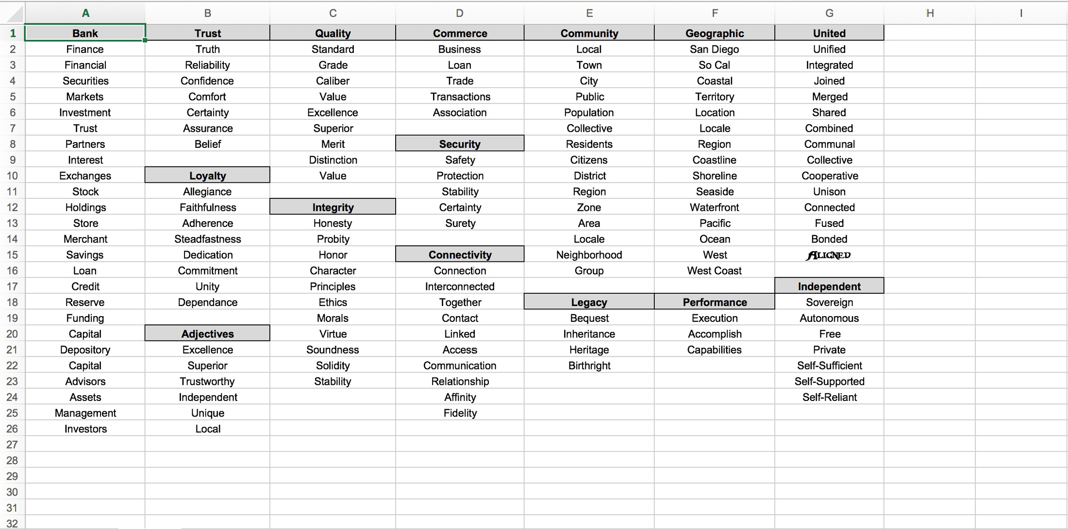

Through this exercise, we were able to measure opinions and results throughout the group, and eventually, narrow down the most desirable words with which we could create a name and identity for the new bank.

Although all the members had opinions on their favorites, Endeavor Bank was the clear winner. With total buy-off from all parties involved, this was a major step that allowed us to move forward in a clear direction. After tallying all the results and reviewing all the notes and opinions, we made our formal recommendation to pursue this identity.
The Logo
After the successful result from the naming process, the next phase was to begin visualizing what “Endeavor Bank” might look like.
We began by making dozens of icons and variations that covered a wide variety of concepts. From there, we narrowed down the field based on what we could glean from the initial feedback and interviews. We put together several presentations of various ideas to show the larger group, carefully curating the number of choices. We strive to give a wide variety, without overwhelming anyone with too many choices.
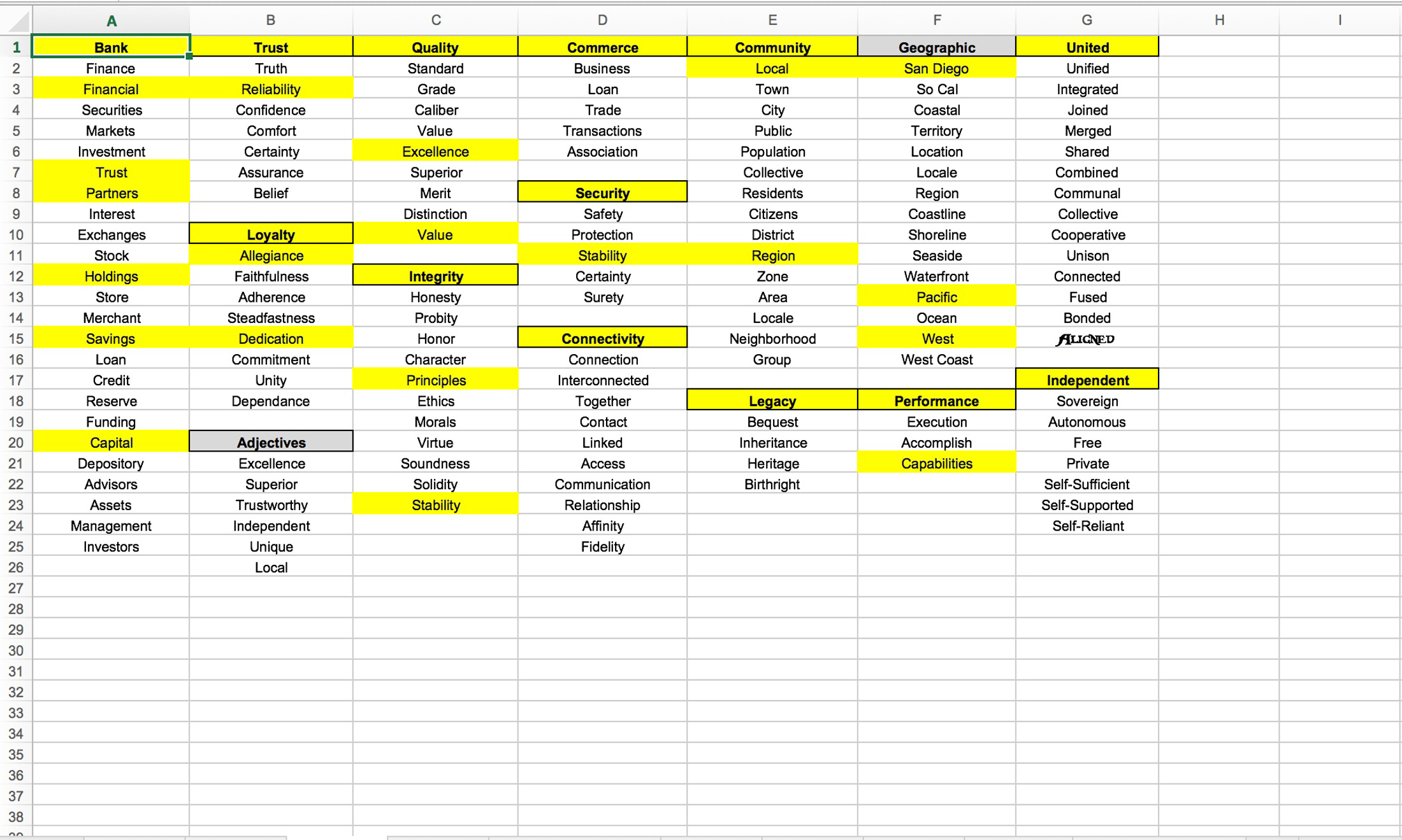
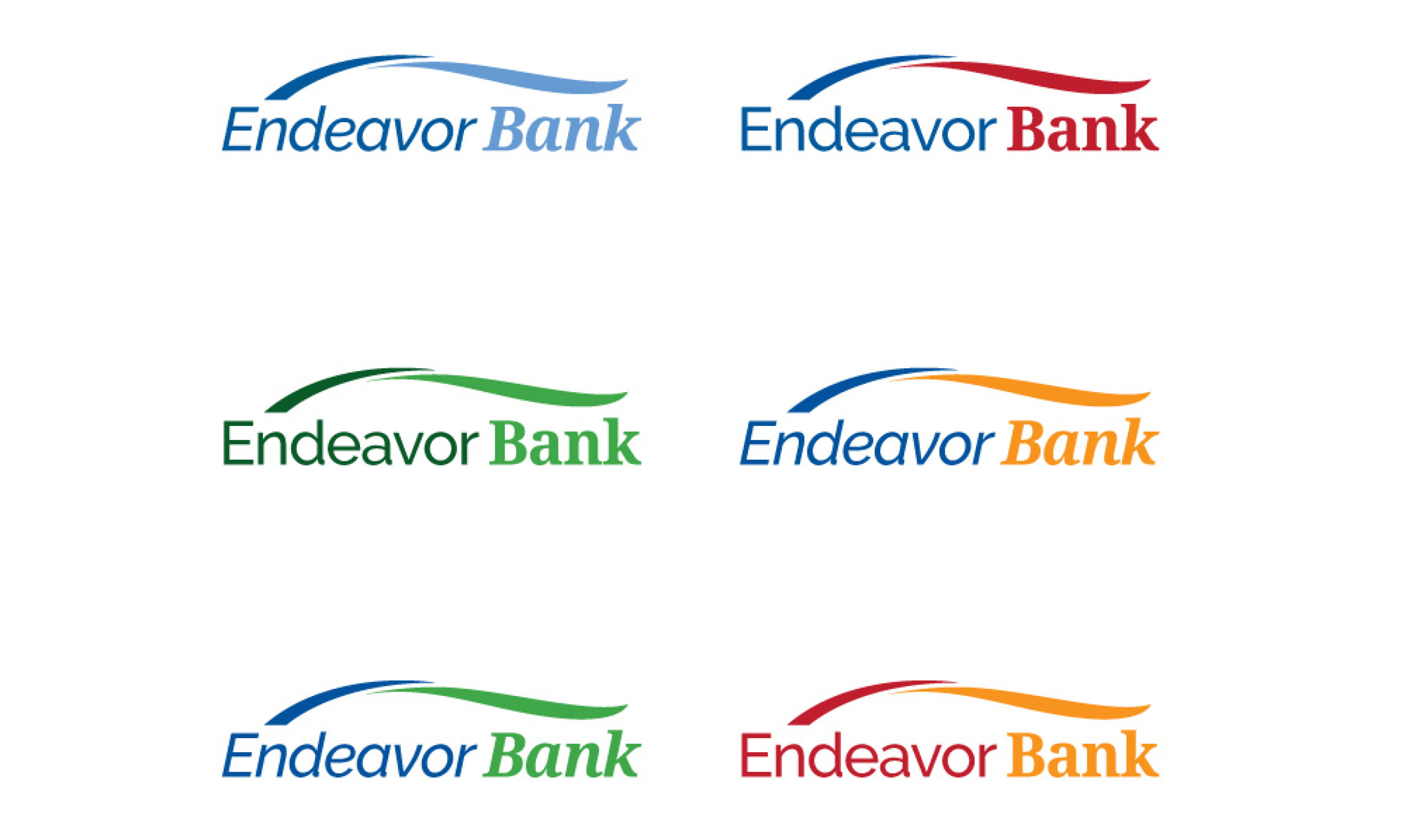
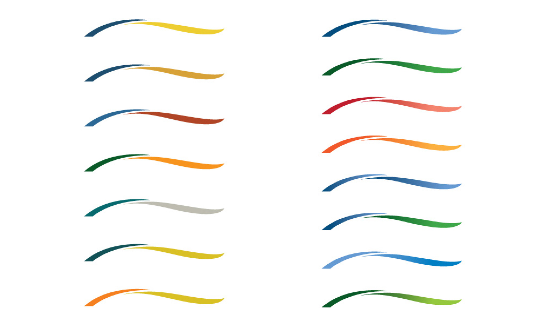
Early Icon Designs
Being a San Diego-based company, we created some options and themes centering on direction, sailing, astronomy, water, wind, and wayfinding, as well as plays on the main letters “E & B” for Endeavor Bank.
After receiving all the feedback from the general ideas, we were able to tighten our net and our focus, eventually settling on a bridge form with the suggestion of ocean waves. This helps to symbolize the bank’s mission to assist businesses in their journey and to help them navigate the potentially challenging waters ahead of them.

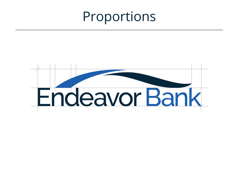
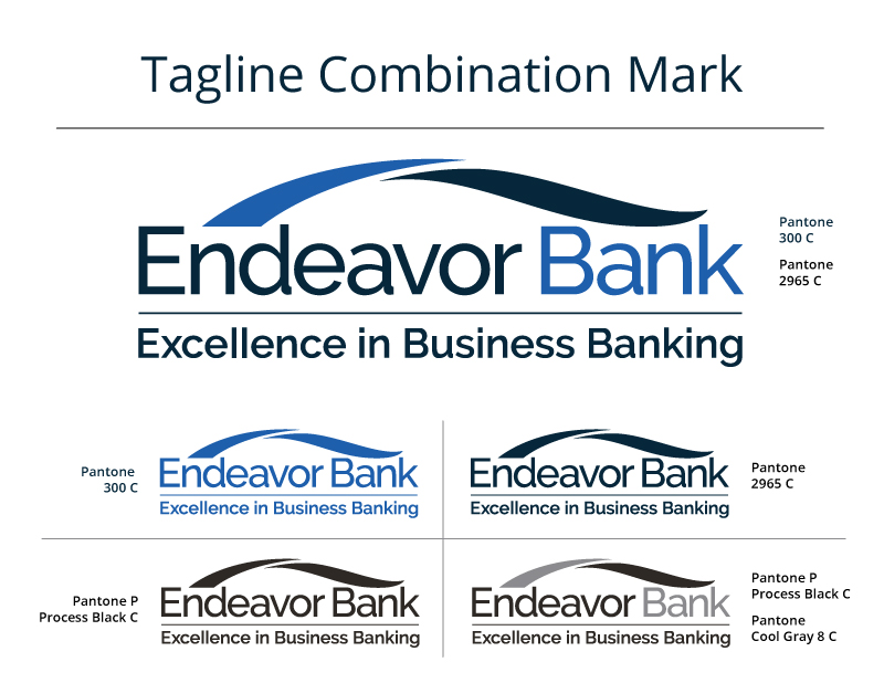
Final Logo Design
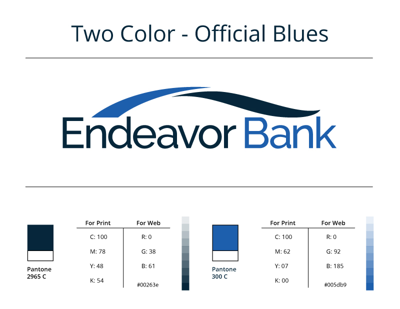
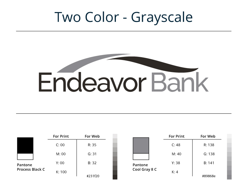
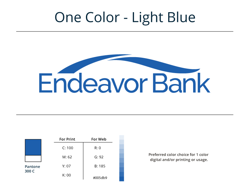
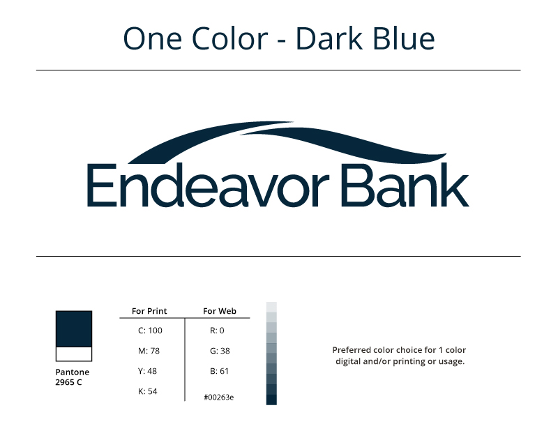
From this stage, our next step was to finalize the colors, details, and proportions, as well as develop a branding guide to serve as a roadmap moving forward. We offered various color options, eventually settling on tried-and-true blues to evoke stability, confidence, serenity, and trustworthiness.
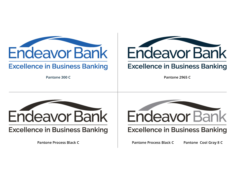
Color Options
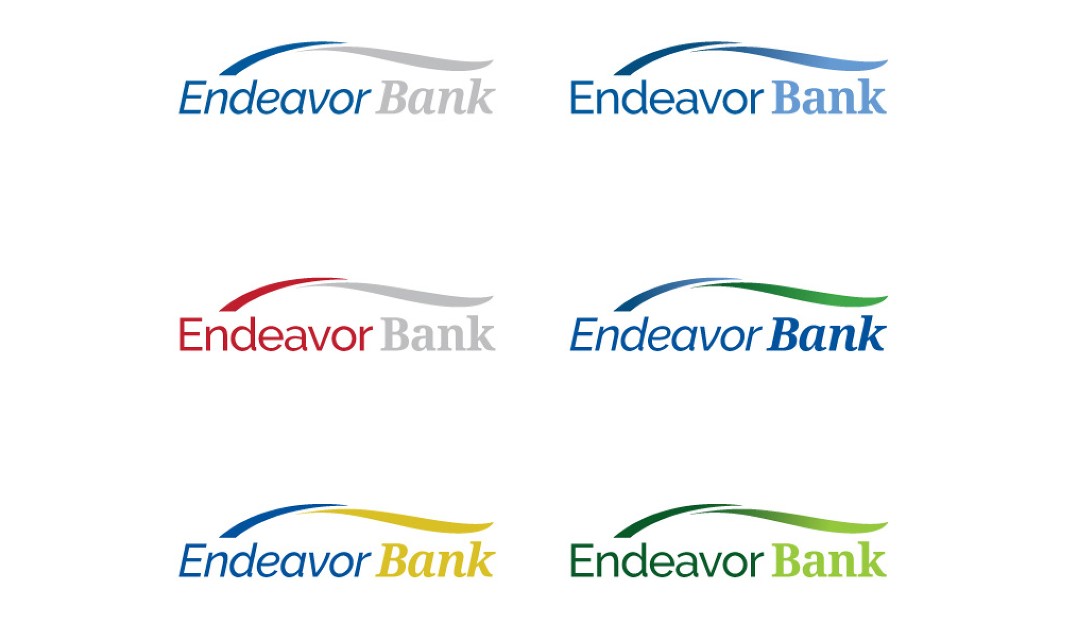
We experimented with a multitude of color combinations. In the end, the committee agreed that a blue color scheme embodied the stability and trustworthiness a bank should have. It also helps to convey a serene confidence that is easy for their target audience to relate to.

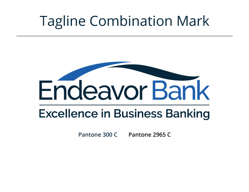
Final Full-Color Logo
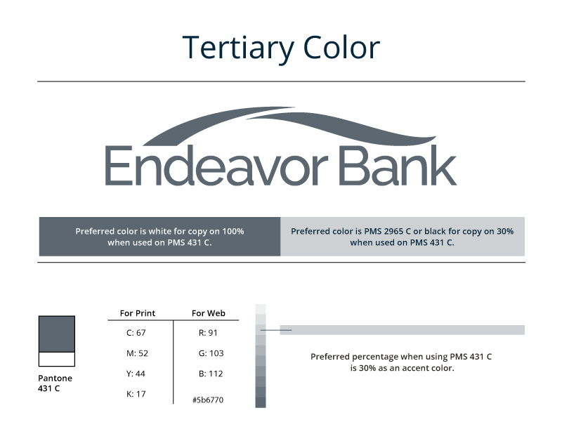
Once we had the color scheme, we could then concentrate on the finer details of alignment, proportion, type weight, PMS print colors, and create a logo package for the team to use both in print and online.
Branding Guide
Collateral
With the name and logo solidified, as well as the brand coming together, we could then extend the brand and design elements to print materials and eventually an online presence. We explored a variety of directions and executions to find elegant solutions for the various materials.
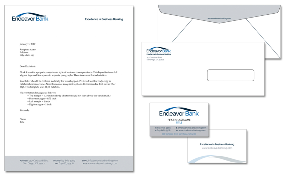
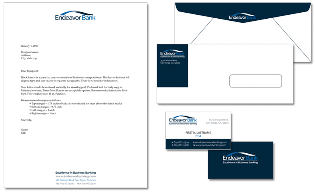
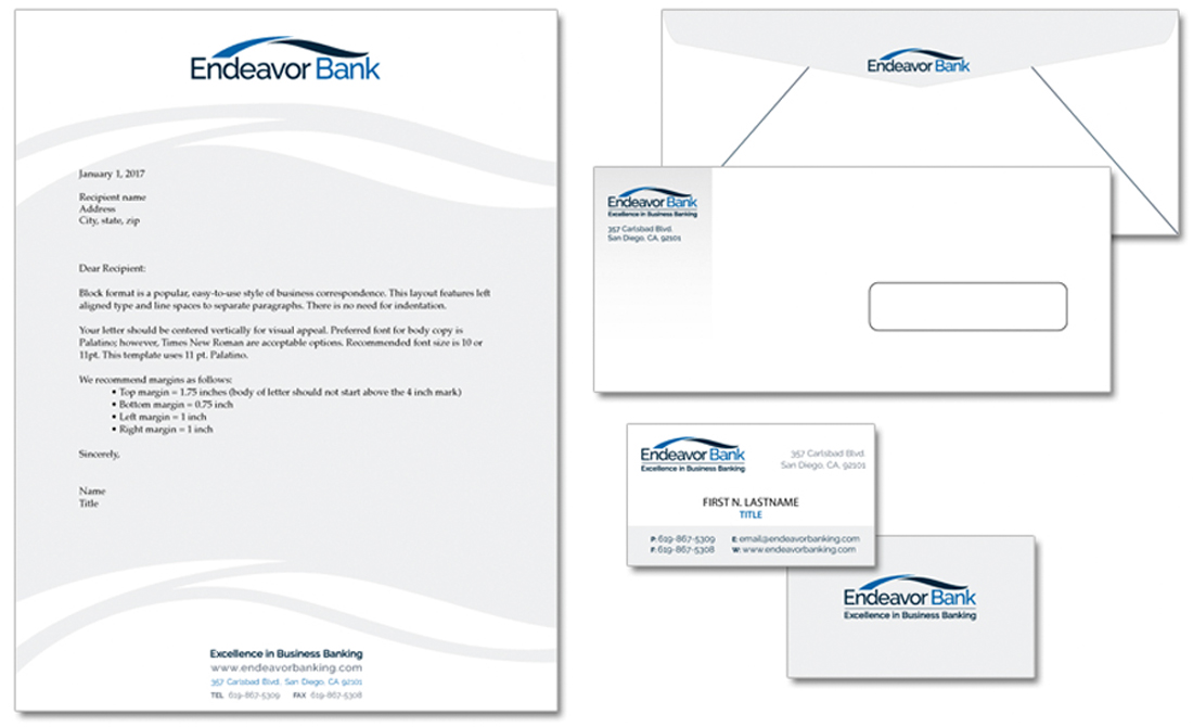
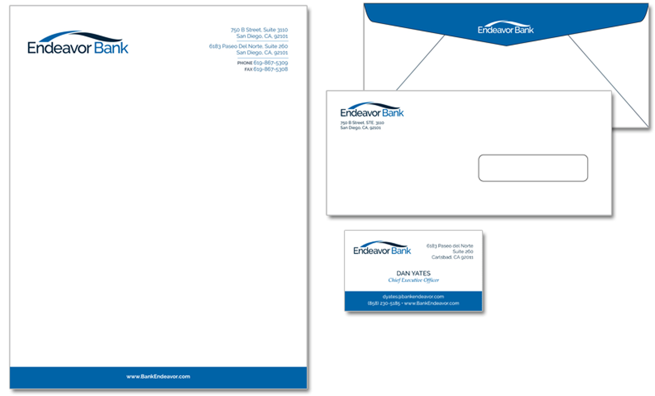
The client ultimately settled on a simple and conservative design for the print materials, falling in line with our goal to embody stability and confidence.

Final Stationary Print Materials
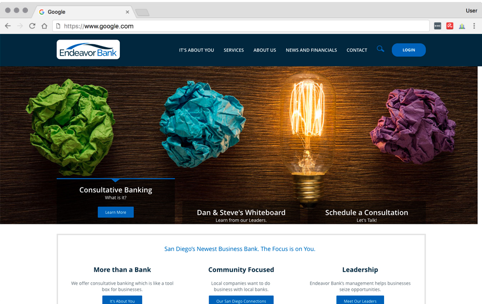
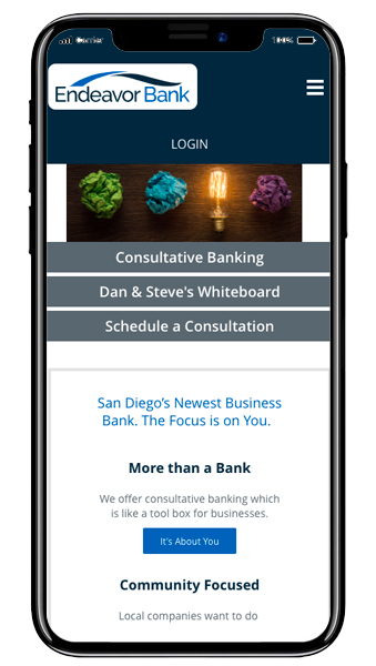
Website
Spork Designs was asked to help create an informational online presence for the bank. Following our typical strategy, we analyzed the target audience, as well as the competition, and discussed how our client will grow over the next few years. This enabled us to build a website that is flexible and can grow as new products and services are added. As part of the Discovery Phase, we did research including studying customer feedback and Google Analytics and reviewing material that defines the client’s industry.
Our design process for website development typically starts with navigation development and a Site Map. We created the overall site structure that serves as the roadmap for the internal pages based on a client’s needs, services, and offerings. After the structure was developed, we focused on laying out the site’s aesthetic structure as black and white user interface sketches for review and approval.
Next, our design team developed the web site’s look & feel and personality, following the guidelines we established with the client. The result was a flexible and expandable website that can adapt and remain secure as the company grows.
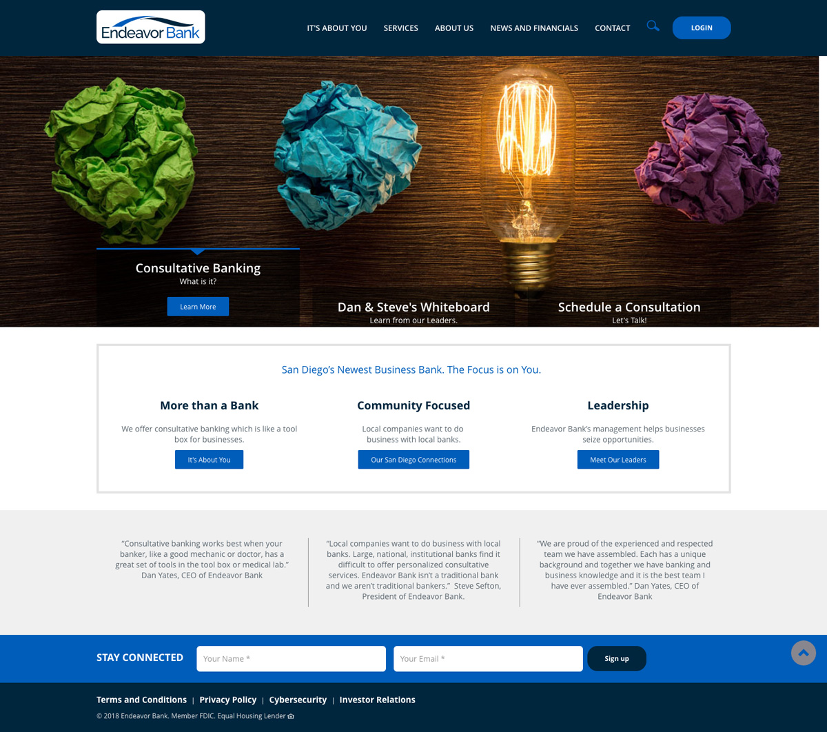
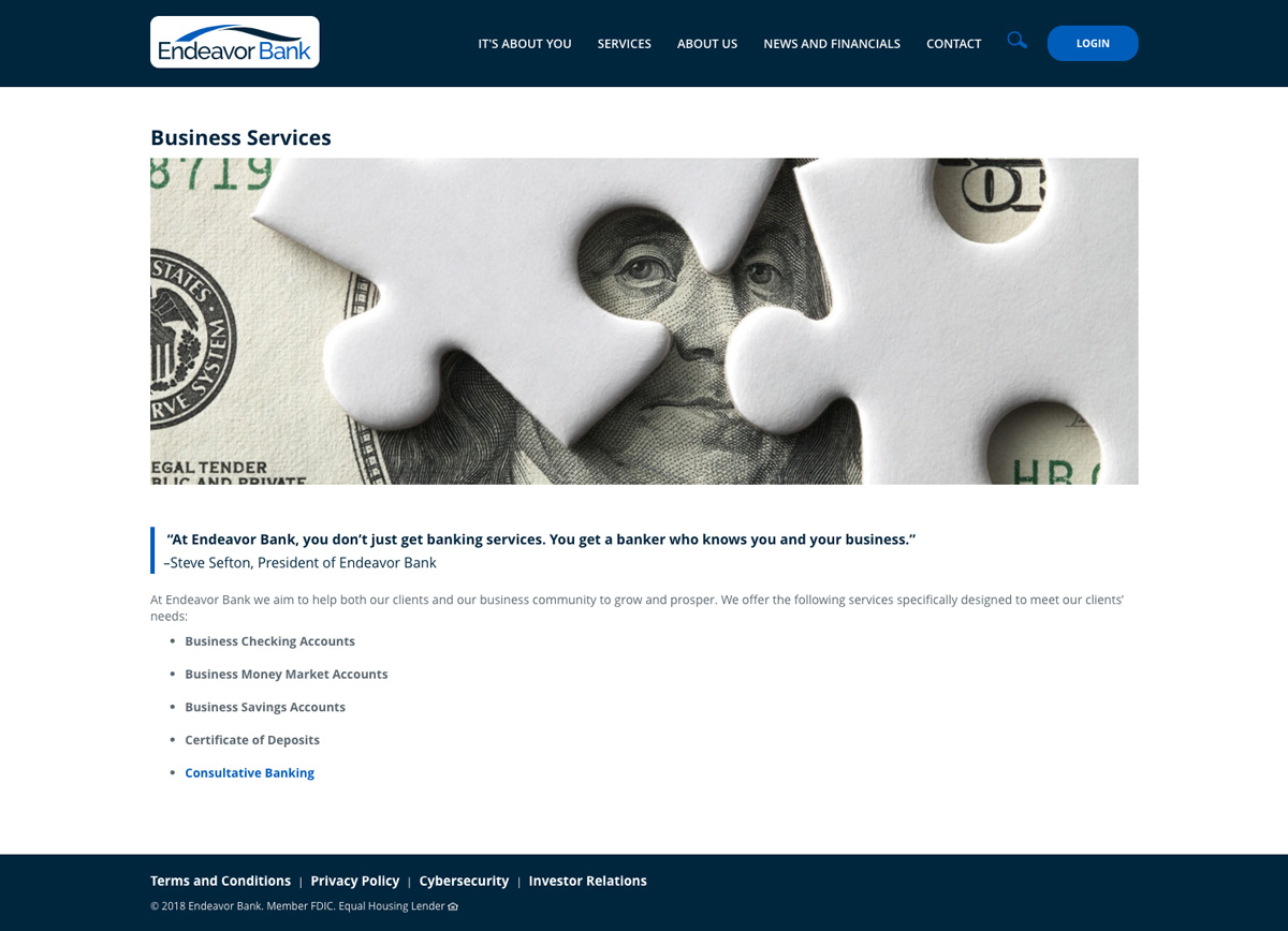
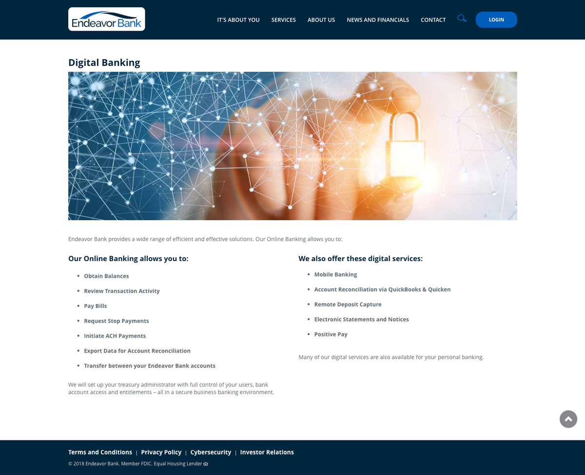
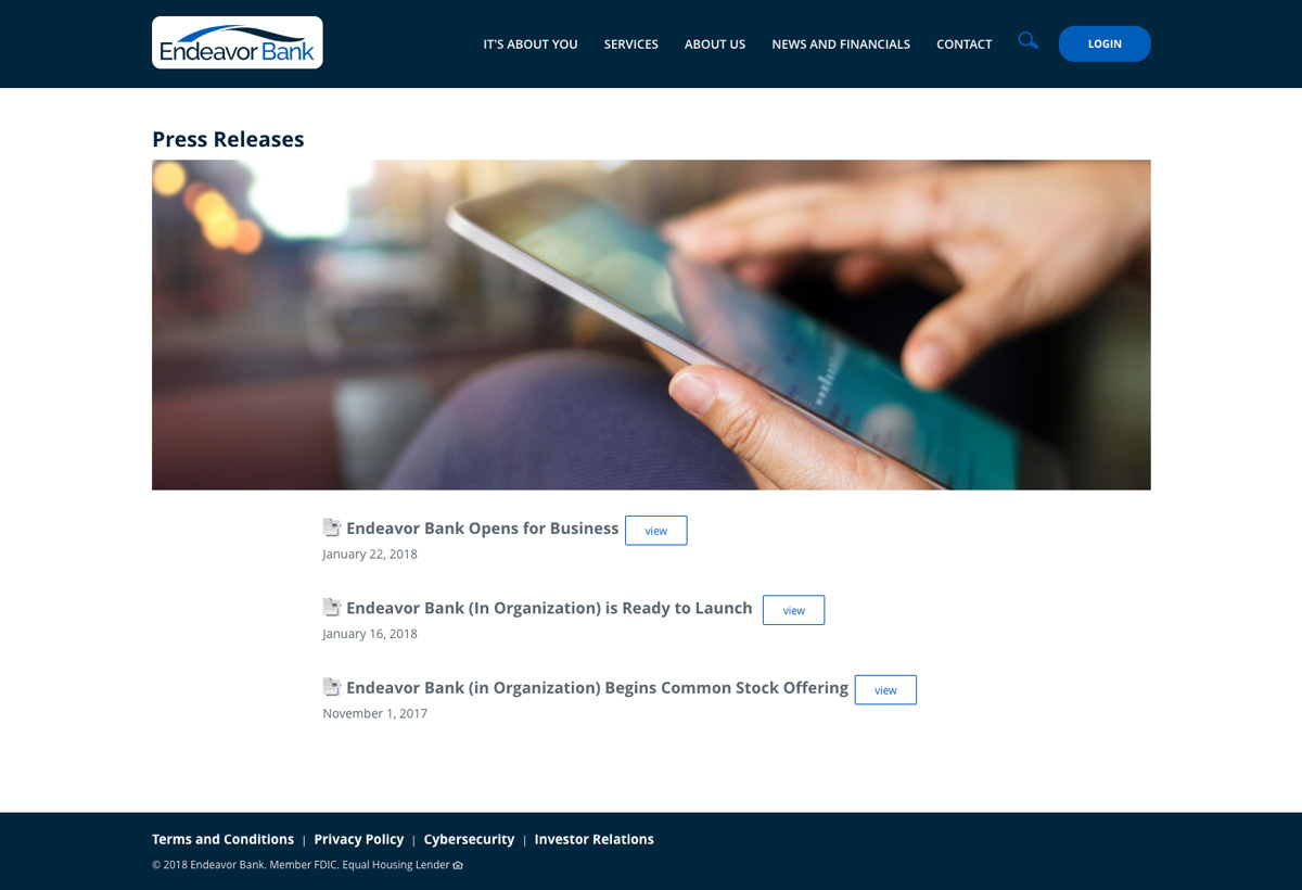

Ultimately, we were able to find an online format that is flexible and looks consistent across all devices and platforms.